
Project Overview
FootStake: A New Brand for a New Market
The Shore Tee by FootStake™ is a unique outdoor accessory for adventurous kayakers and canoeists. It offers a portable, lightweight way to store watercraft, ideal for those frequenting lakes, rivers, or campsites. Because its purpose and audience differed from those of its parent company, Lacks Enterprises, Inc., a global leader in plastic product design and manufacturing for the automotive industry, any visual or tonal overlap between the two could cause brand confusion.
We set out to create a distinct, stand-alone brand identity for FootStake™ from the ground up, positioning it for a successful market launch.
Year
2017
Role
Senior Designer · Creative Lead
Agency
Sage Island
Contribution
Art Direction · Copywriting · Front-End Design · Graphic Design · Packaging Design · UI · Visual Design · Web Design
Results
80%
Site Traffic from social media marketing
9K
Inbound Links driving video views at $0.01 per engagement
2.7K+
Facebook Followers

Challenge
Building Brand Exposure Within the Outdoor Community
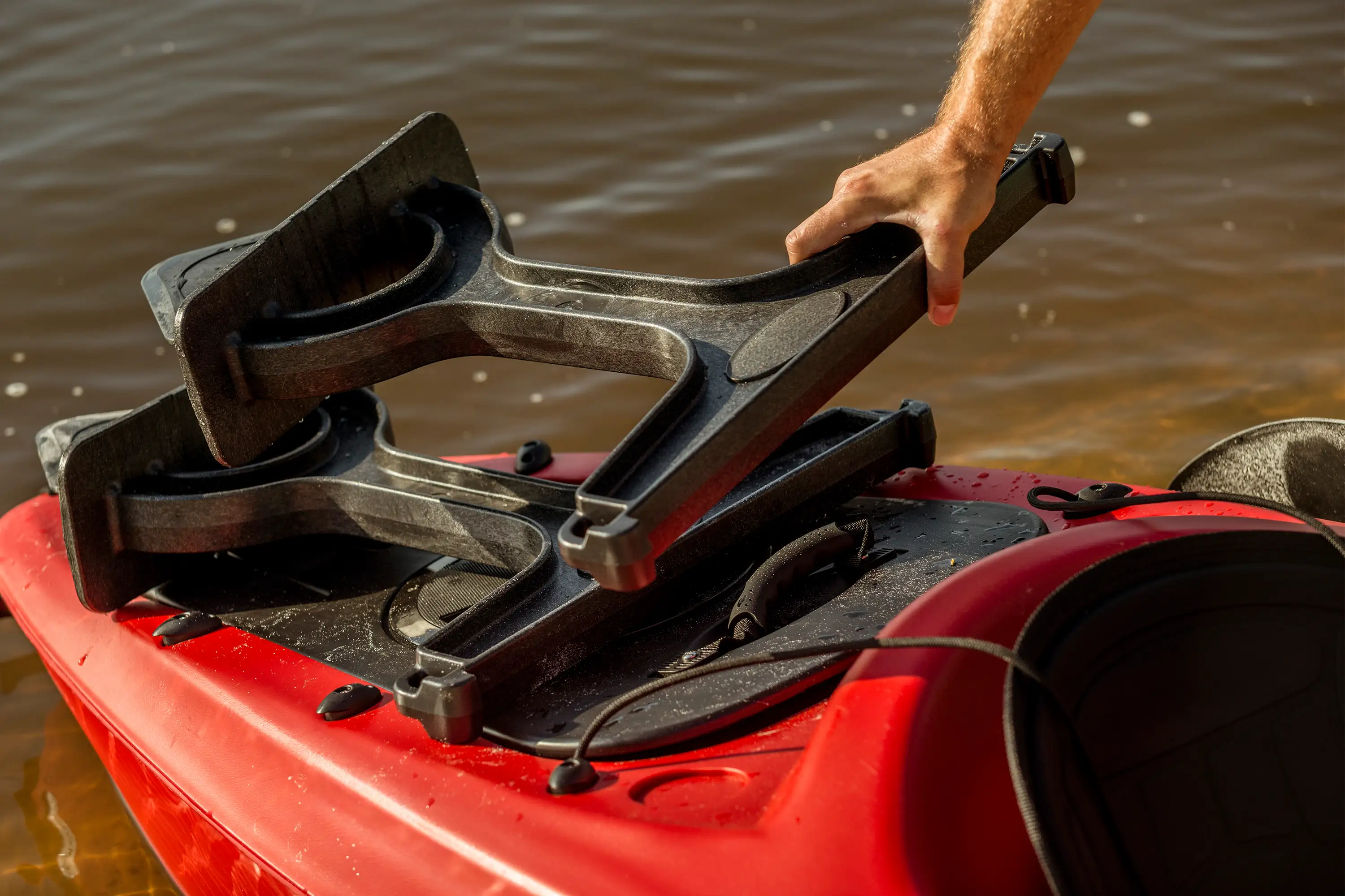
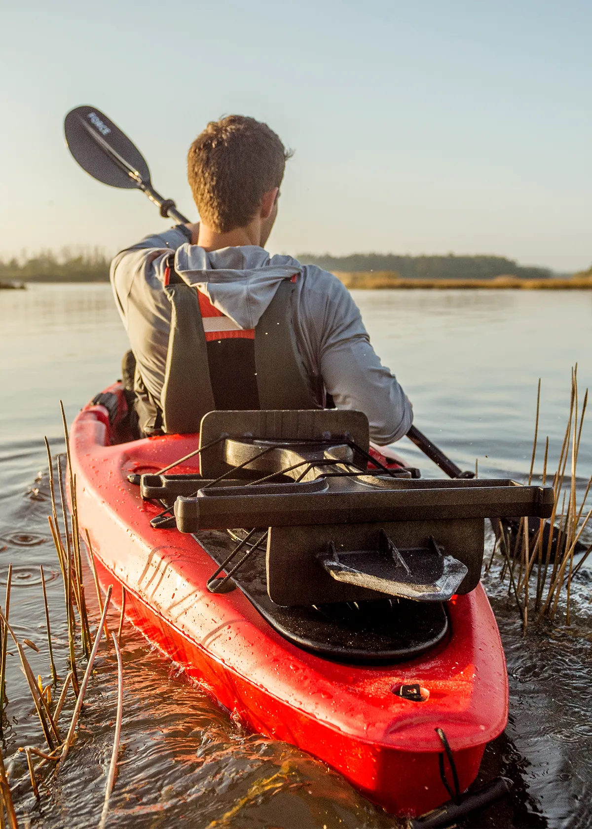
FootStake was built to solve a real problem: safely storing large, expensive boats during camping or hiking. Boating and kayaking enthusiasts need a reliable way to protect their gear from the ground and elements while traveling. FootStake’s simple, portable system lets users drive a stake into the ground and rest their vessel on top, simplifying launch and storage. This solution became the guiding principle for our creative strategy. The brand had to embody the same qualities as its product: simplicity, portability, and efficiency.
Brand messaging supported this core promise. The primary message presented the Shore Tee as a portable, easy-to-use boat rack for storing kayaks, canoes, and other oversized items safely at home or mid-adventure, making it both a practical tool and travel essential. Secondary messaging highlights its value in protecting prized boats, enabling exploration, and showcasing clever design. These messages guided the visual identity, helping each creative asset support the brand’s value and connect with the intended audience.

Brand Persona Development
Design for the Demographics: A Persona-to-Design Blueprint
The brand’s success hinged on a deep understanding of its target audience, which we captured in two distinct personas: "Brad the Outdoorsman" and "Anna the Engineer".
Brad the Outdoorsman, 38, is a realtor and family man in Grand Rapids, Michigan. He and his wife, Megan, share a passion for water sports and the outdoors, which they are actively instilling in their two children. Brad is a self-described "weekend warrior" who loves the outdoor lifestyle, including the latest gadgets and tools. His purchasing decisions are influenced by clever product design and how an item enhances or protects his existing "big ticket items" like his canoe or tent. He browses magazines like Outdoor Magazine and Popular Mechanics, and he is drawn to innovative and attractive packaging and in-store promotions.
Anna the Engineer, 57, is a retired aerospace engineer in West Palm Beach, Florida. Having moved from a colder climate, she is determined to make up for lost time by enjoying the water. Anna is a pragmatic, research-driven buyer. She diligently researches every piece of equipment, living for product reviews on blogs and sites like Boing Boing, Gear Junkie, and Adventure Journal. She is a highly-rated Amazon reviewer and even runs her own fledgling outdoors blog. Anna is not an impulse shopper; she becomes a loyal customer and brand ambassador once she understands a product's utility and value. Marketing to Anna requires a focus on design, utility, and partnerships for reviews and insights.
At first, these two personas might seem different: one is motivated by lifestyle and emotion, the other by logic and research. Both value design and utility. Brad likes smart gadgets, Anna values usefulness. This shared value connects them. The brand could appeal to both with a visual style that speaks to each.
Every creative decision was a direct response to the needs of these personas. The art direction, with its use of vibrant, aspirational lifestyle photography, directly appeals to Brad's persona, showcasing family fun and the lifestyle the product enables. The clean and well-structured website layout satisfies Anna's desire for efficient access to product details and information, reinforcing the product's functional value.

Visual Identity
From Product to Personality: Crafting an Iconic Identity
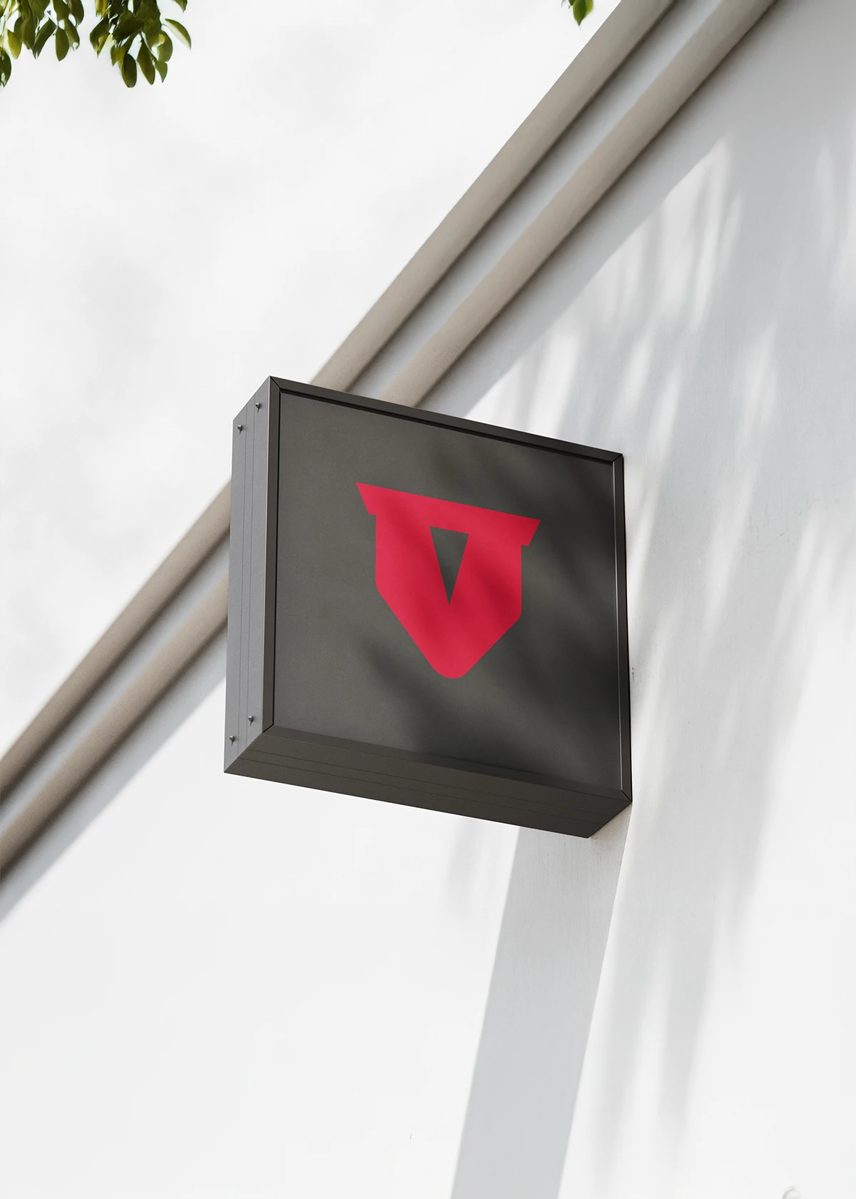
The Logo: An Engineered Solution
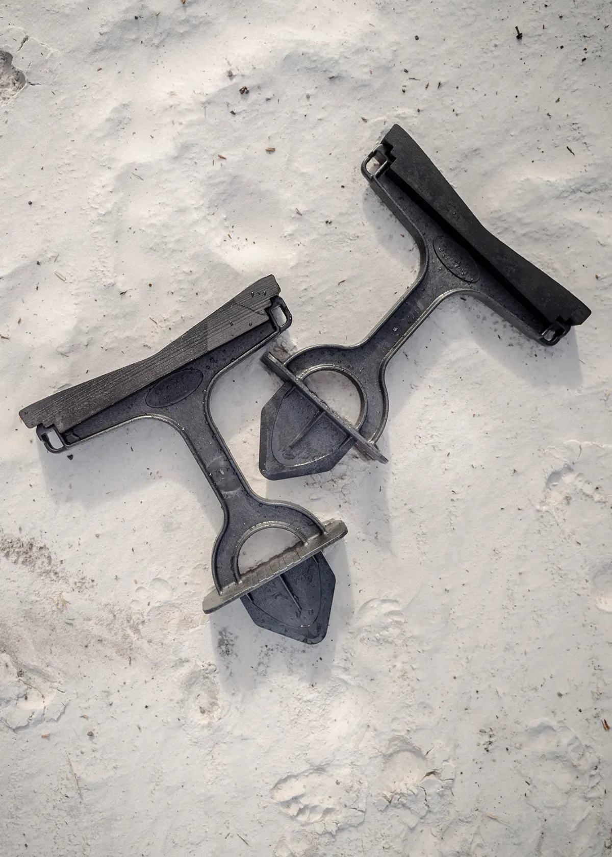
Instead of imposing an arbitrary symbol on the brand, our creative team drew the visual identity directly from the product's core functional form—creating a powerful, authentic link between the product and its digital representation. The FootStake logo exemplifies a creative strategy rooted in the physical product. The logomark was intentionally crafted to match the patented shovel shape, while custom "T" letterforms in the wordmark borrow the mark’s endpoints and angles.
The identity highlights the Shore Tee's innovative nature and efficiency through modern design and utility, supporting the brand’s focus on engineering, quality, and purpose, making it feel real and trustworthy.
The Color Story and Typographic System
FootStake’s visual identity is anchored by a deliberate color palette and typographic system. We began our initial color exploration, researching popular kayak colors to gain a deeper understanding of the market's existing visual language and to ensure the brand felt both unique and "at home" in its niche. The chosen primary brand red is a vivid color of action, energy, and adventure. Selected for its ability to stand out, the brand colorway directly aligns with the aspirational "weekend warrior" persona. In outdoor photography, this high-contrast color also provides a strong visual anchor against natural greens, blues, and browns, making the identity visually salient.
The typography further supports the brand's personality. The primary typeface, Teko, is a sans-serif script with a "modern, yet rugged quality". Applying varying font weights also allowed us to create a clear hierarchy in all brand communications, ensuring that the brand's voice was delivered with clarity and authority.

Art Direction
Visual Storytelling: Bringing the Brand to Life
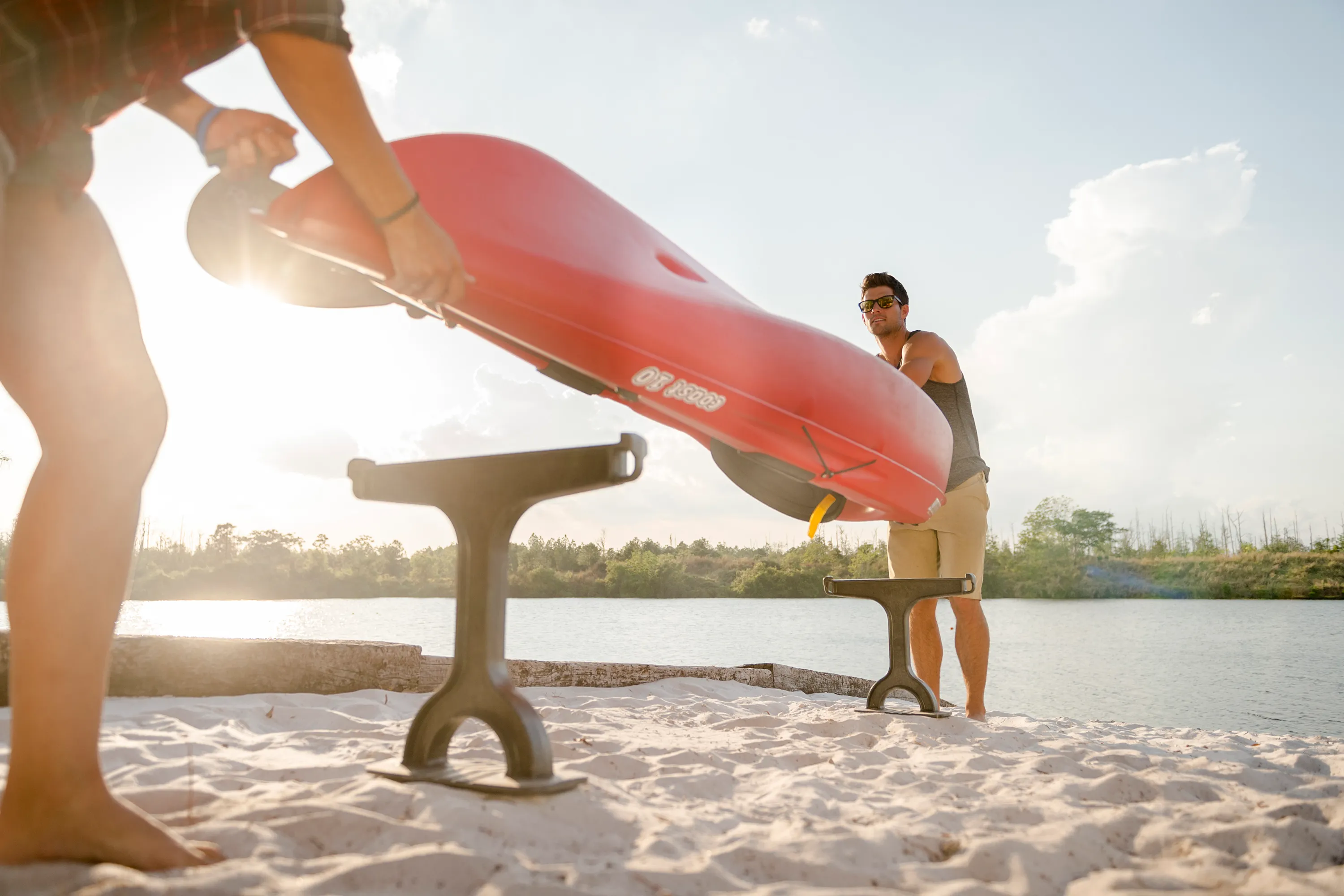
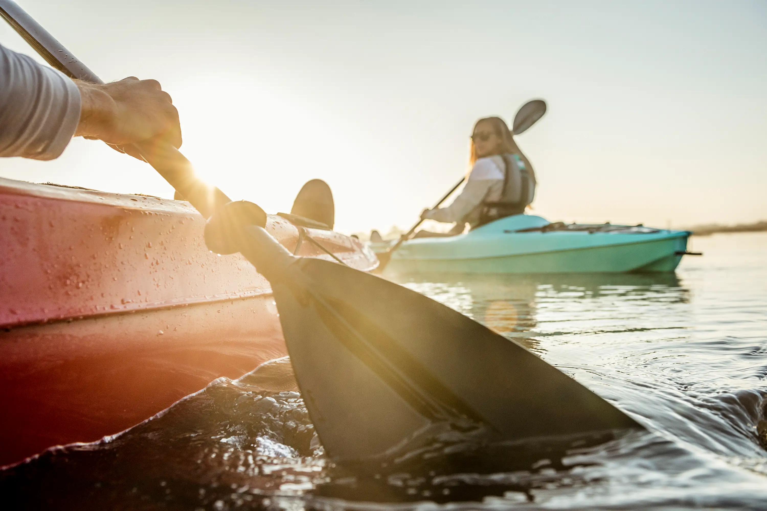
To align with FootStake's "weekend warrior" spirit and family-friendly brand, we commissioned photographer Chris Garrison to create a series of lifestyle and product shots. The goal was to showcase the Shore Tee's versatility while directly appealing to the target audience.
By setting the product in natural outdoor environments, such as lakeshores with canoes and kayaks, the photography transcends simply showing the product; it tells a powerful brand narrative. The images convey that the Shore Tee is an "adventure enabler," promising an experience rather than just a product.
Additionally, the consistent integration of the brand's high-contrast primary red throughout the visual identity ensures brand recognition in any environment. This cohesive visual system strengthens the brand's presence across all consumer touchpoints.


Web Design and Development
The Digital Canvas
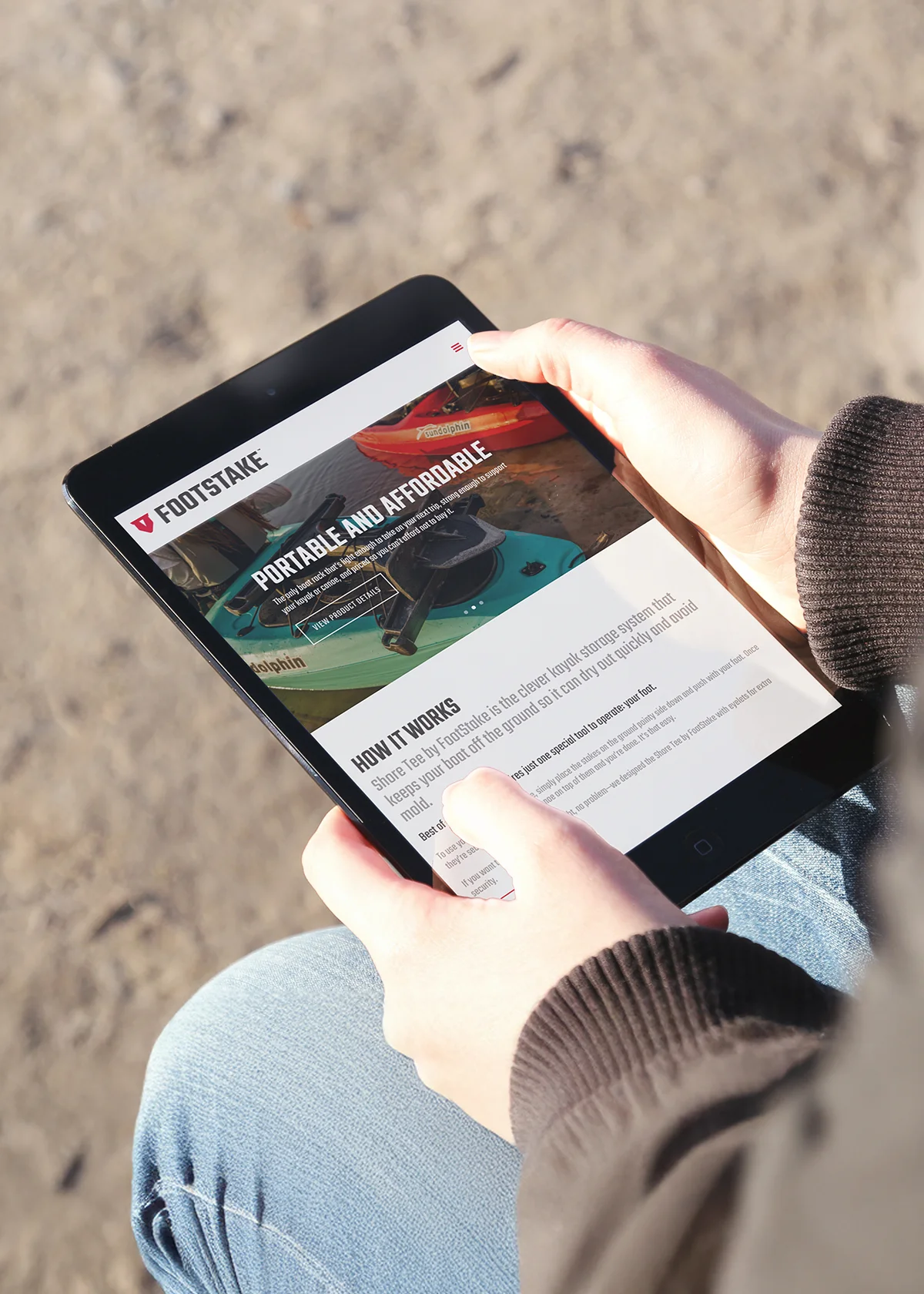
FootStake’s website is the brand’s digital core. Meticulously designed to serve its customers, the clean and attractive layout is well-organized with bold images that appeal to the rugged, aspirational aesthetic of the adventure lover. A logical information flow and clear site structure caters to users in need of detailed, accessible product information. We also integrated an active e-commerce storefront and shopping cart, allowing customers to make direct purchases of the Shore Tee and its accessories.
The site's information hierarchy directly supports its UX strategy, anticipating the user's journey from discovery to research to purchase.


Content Marketing · Social Media Marketing · Packaging Design
Tangible Touchpoints: From Screen to Shelf
FootStake’s strong online presence was driven by a strategic content and social media marketing plan focused on engaging its target audience. The brand's social accounts shared newsworthy articles, helpful tips, and unique product features to keep potential customers informed and interested. Our approach built strong customer relationships, establishing FootStake as a valuable online resource.
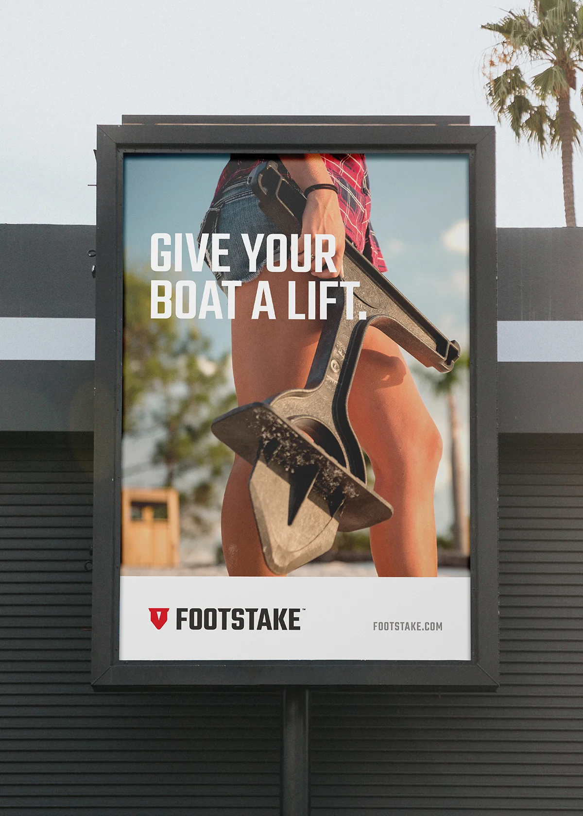
To strengthen FootStake's brand recognition across digital and retail, we created new physical packaging for the Shore Tee product. The package design—featuring the iconic logo, vibrant color palette, and rugged aesthetic printed on full-color corrugated boxes—became a key extension of the brand identity—ensuring an instantly recognizable and cohesive brand experience on retail shelves.
From packaging to digital advertising and social media, the FootStake identity functions as a unified system across all consumer touchpoints, building and reinforcing its brand recognition.


Credits
Creative Direction: Mike Duncan
Full-Stack Development: Brian Carroll
Photography: Chris Garrison
Project Management: Kim Lannou, Gregory Mason
Matt Miller
Art Direction · Design