
Project Overview
Tidal—Small Business Checking, Simplified.
When Live Oak Bank introduced Tidal Small Business Checking, it was entering a new category for the bank: everyday business banking.
Live Oak had already built a strong reputation around helping small businesses grow through lending and deposit products, but checking introduced a different kind of relationship. Unlike a savings account or CD, checking is woven into the everyday rhythm of running a business—money comes in, payments go out, balances rise and fall, and business owners need the tools and support to keep everything moving.
The challenge was to introduce Tidal as something more than another business checking account. It needed to feel simple, modern, personal, and distinctly Live Oak.
Year
2021–2023
Role
Art Director
Organization
Live Oak Bank
Contribution
Art Direction · Campaign Strategy · Copywriting · Creative Conceptualization · Digital Advertising · Graphic Design · Messaging · Social Media Marketing · Visual Design
Results
1,300+
New customer accounts opened by end of Q3 2022
66%
YoY increase in Business Savings and CD balances, accelerating broader deposit strategy by Q4 2022
250
new business account acquisitions per day during a period of market volatility
Challenge
Introducing a New Kind of Relationship
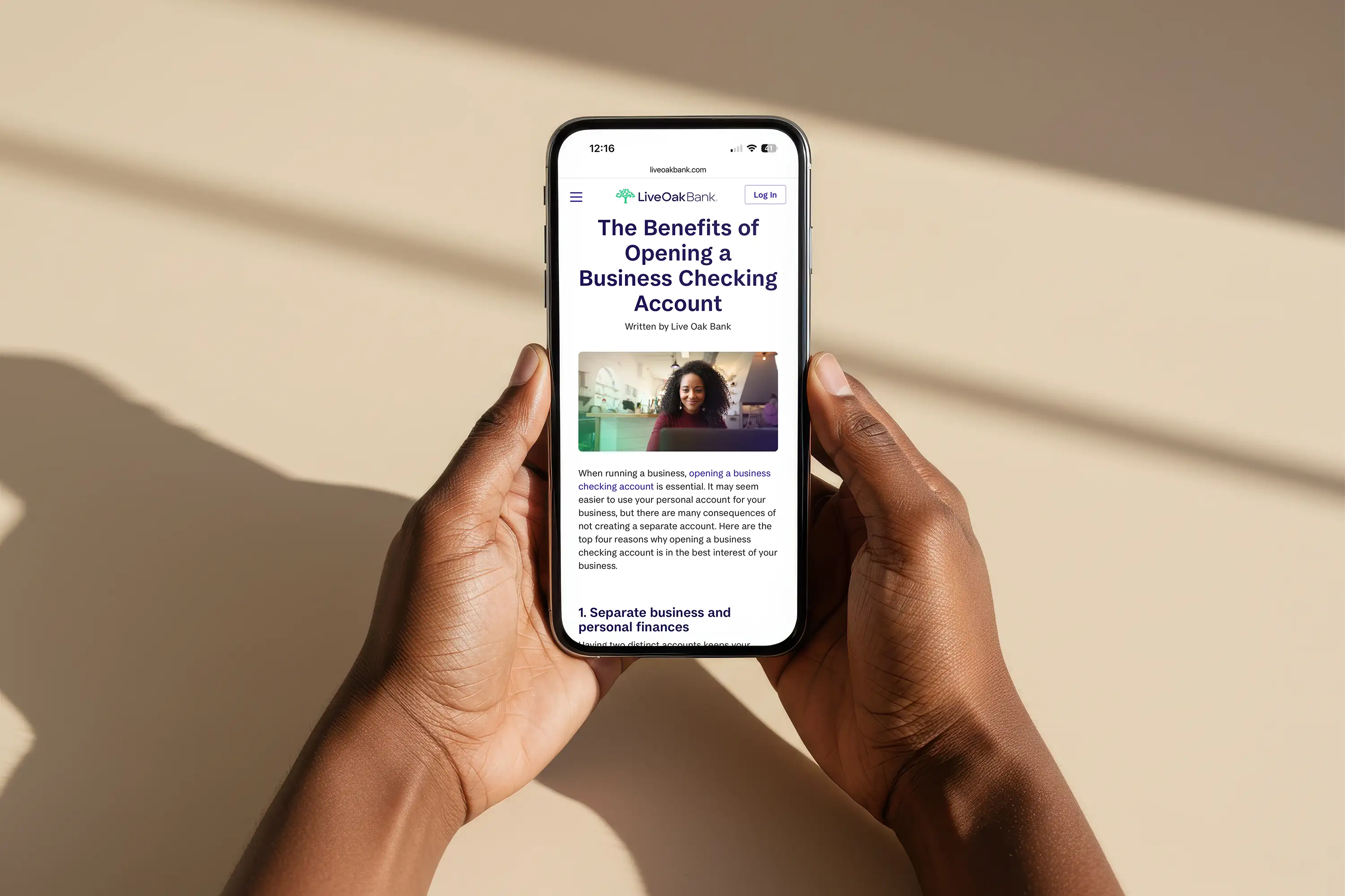
Launching a checking account presented a different communication challenge than marketing many of Live Oak's existing financial products.
Checking is inherently functional. Customers care about fees, access, security, deposits, payments, ATMs, mobile banking, and account management—but leading with a list of features wasn't enough to differentiate Tidal or make the product memorable.
At the same time, small business owners don't experience their finances as a collection of individual banking features. Their financial lives move with the business itself. Some days are predictable. Others aren't. The creative opportunity was to position Tidal around that reality while making the product feel approachable and uncomplicated.
Research and product discussions reinforced a simple truth: small business owners were already juggling enough complexity. Banking shouldn't add to it.
That led to the central idea: Business checking should flow with the business—not get in its way.
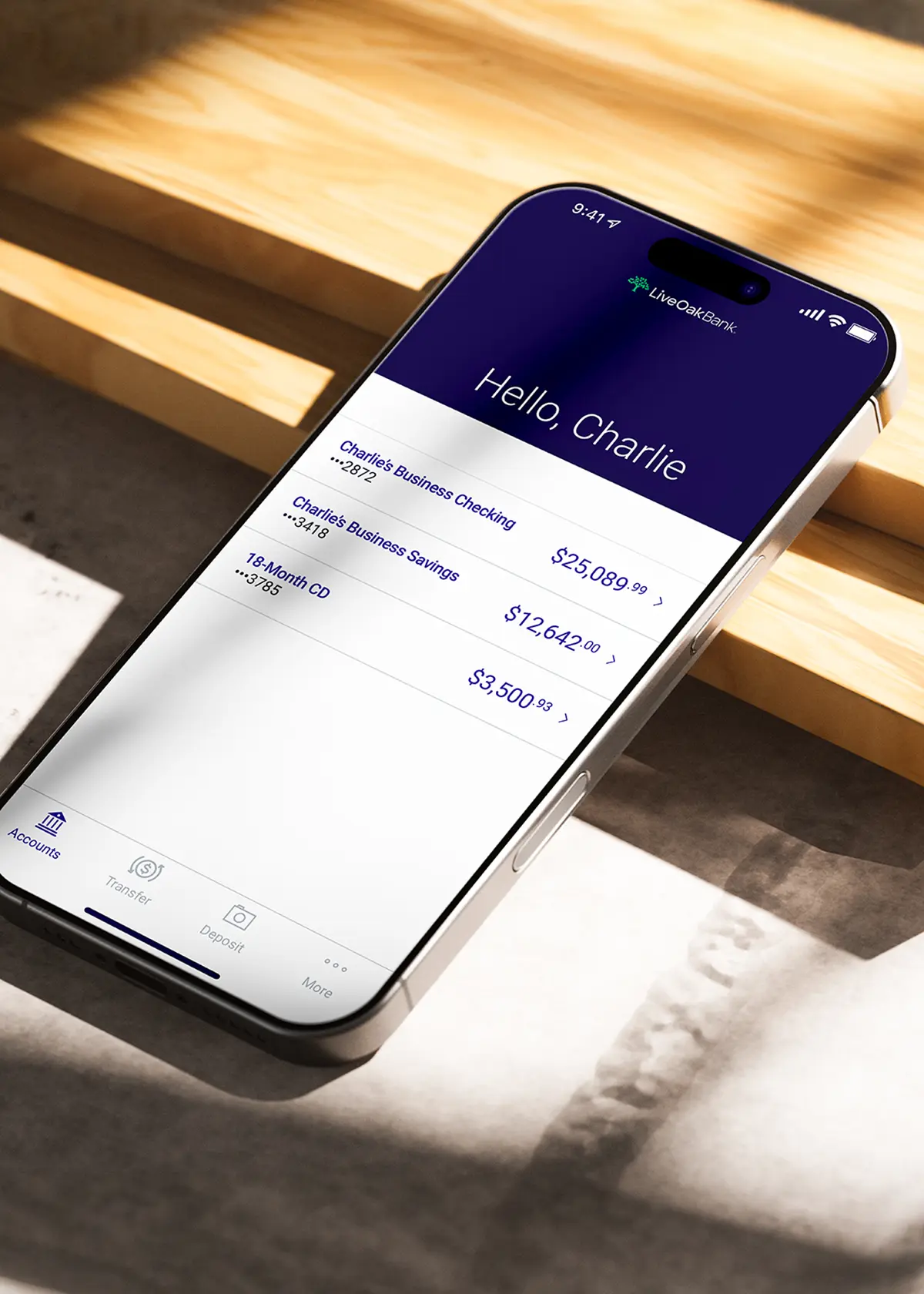
The product's digital-first experience, no monthly maintenance fees, no minimums, nationwide in-network ATM access, mobile functionality, and personalized support all reinforced that promise.
Campaign Strategy
Find the Flow
The product name Tidal gave us a natural conceptual territory.
Tidal waters constantly move. They rise and fall, ebb and flow, and respond to changing conditions. Small businesses do the same. Revenue fluctuates. Expenses arrive unexpectedly. Busy seasons give way to slower ones. Businesses grow, adapt, and change direction. Rather than treating that movement as a problem, the campaign embraced it.
From there, our visual and verbal strategy connected three attributes:
Fluidity
A checking account designed to move with the business.
Simplicity
A digital banking experience that removes unnecessary friction.
Personalized Support
A bank that remains accessible when a business owner needs help navigating the inevitable highs and lows.
The result was a flexible messaging system that could communicate both the emotional and functional value of Tidal while working across everything from a billboard headline to a small digital banner.
Campaign Messaging
From Concept to Campaign Language
We developed the campaign's core messaging and explored several conceptual territories before narrowing the creative around the strongest expression of the Tidal idea.
One early direction focused on predictability—the dependable rhythm of tidal waters as a metaphor for knowing what to expect from your banking experience. Another focused on flow and fluidity, drawing a more direct parallel between the movement of tidal waters and the everyday movement of a small business.
The second territory ultimately became the stronger platform because it connected the product name, customer experience, and emotional benefit in a single idea.
The final messaging system included:
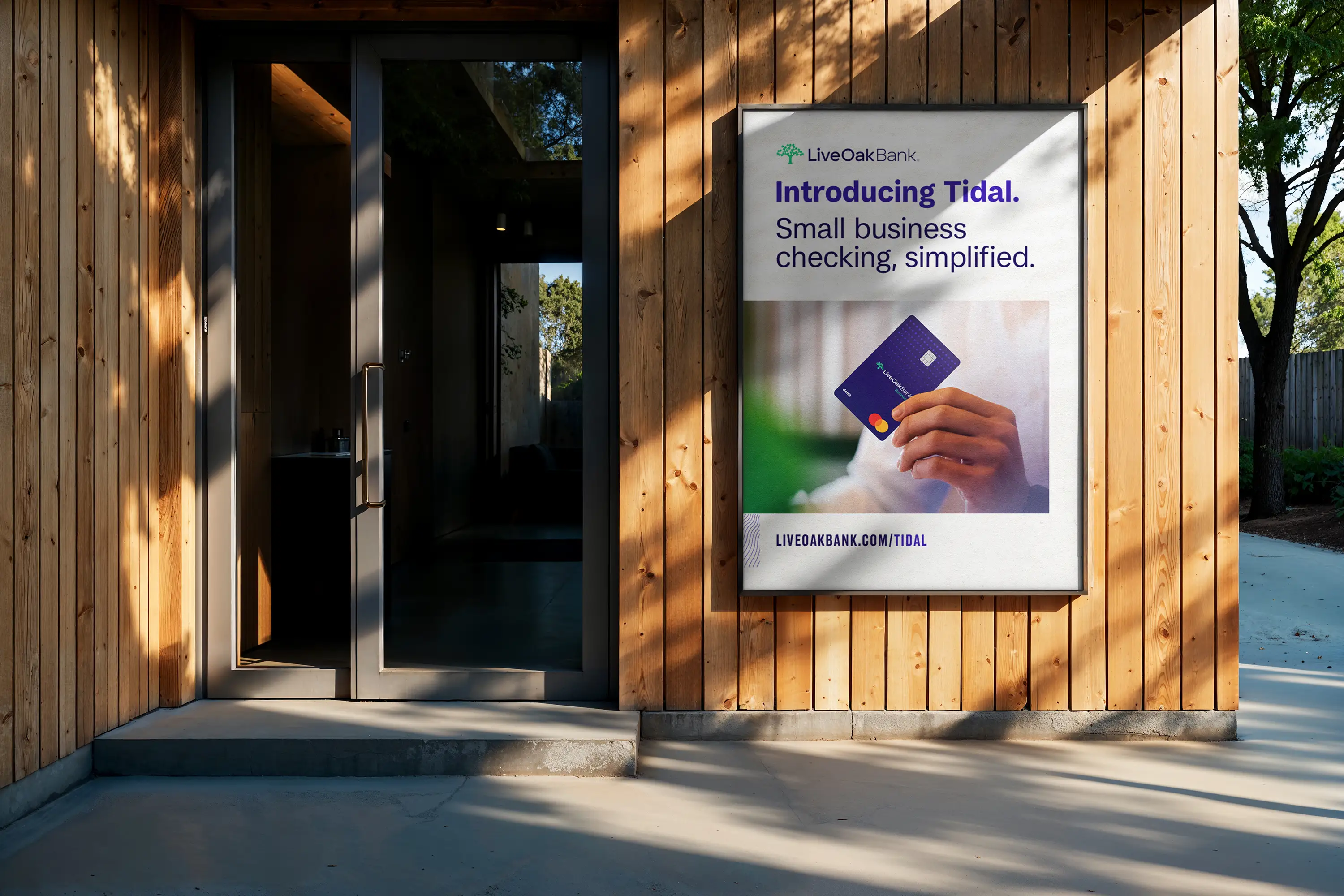
Introducing Tidal.
Small business checking, simplified.
Small business checking, simplified.
Open an account online in minutes.
Business checking that flows with you
Introducing Tidal, a new small business checking account.
Your small business. Your checking account.
Introducing Tidal, a new small business checking account.
These messages became a modular verbal framework for the campaign, allowing individual executions to emphasize different aspects of the product while maintaining one recognizable campaign voice.


Art Direction
Making Banking Feel More Human
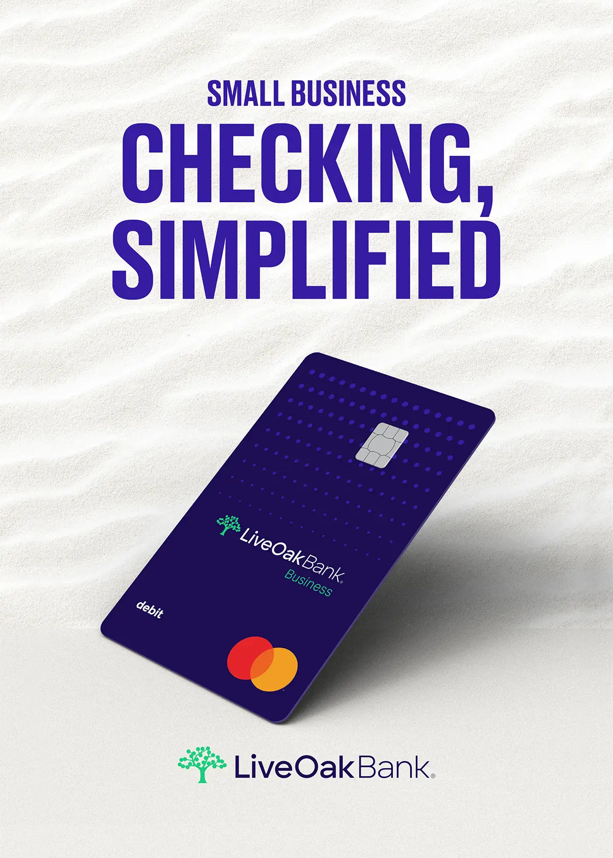
The art direction made flow central to Tidal’s visual language. Rather than depicting water literally, the system used movement, fluidity, and energy to create a brand presence that felt distinctly different from conventional financial-services advertising.
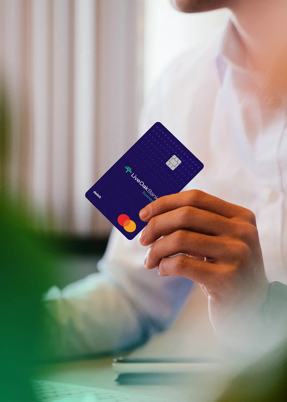
Instead, we used community-focused photography from a small-business shoot in downtown Wilmington to ground the product in the people and places it was built to serve. The photography gave the campaign a sense of place and personality, while the design system provided the consistency needed to move across different media.
Photography, typography, negative space, compositional movement, and concise messaging worked together to create a system that felt contemporary and approachable without losing the credibility expected from a financial institution.
The result was a campaign that could feel at home on a massive airport video wall, a local billboard, a Pinterest feed, or a small printed postcard without becoming visually fragmented.


OOH and Local Market Activation
Building Credibility Where Business Owners Already Look
Because Wilmington was Tidal’s initial proving ground—and the home of Live Oak Bank—establishing visibility and credibility within the local business community was an important extension of the launch strategy.
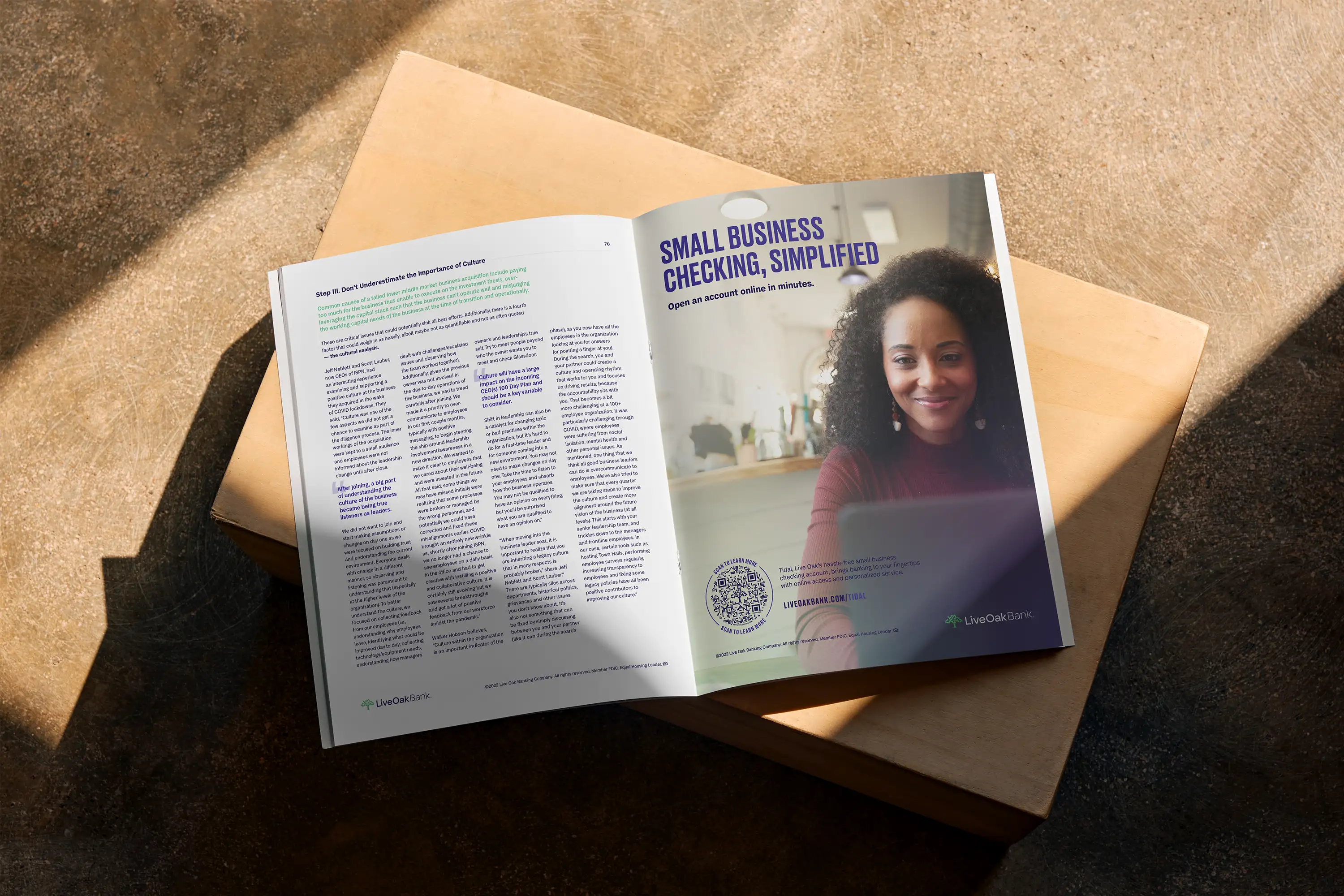
We designed localized OOH creative for digital and print billboards throughout the Wilmington market through Lamar Advertising Company, bringing the campaign into the physical environment where Tidal was being introduced and tested.
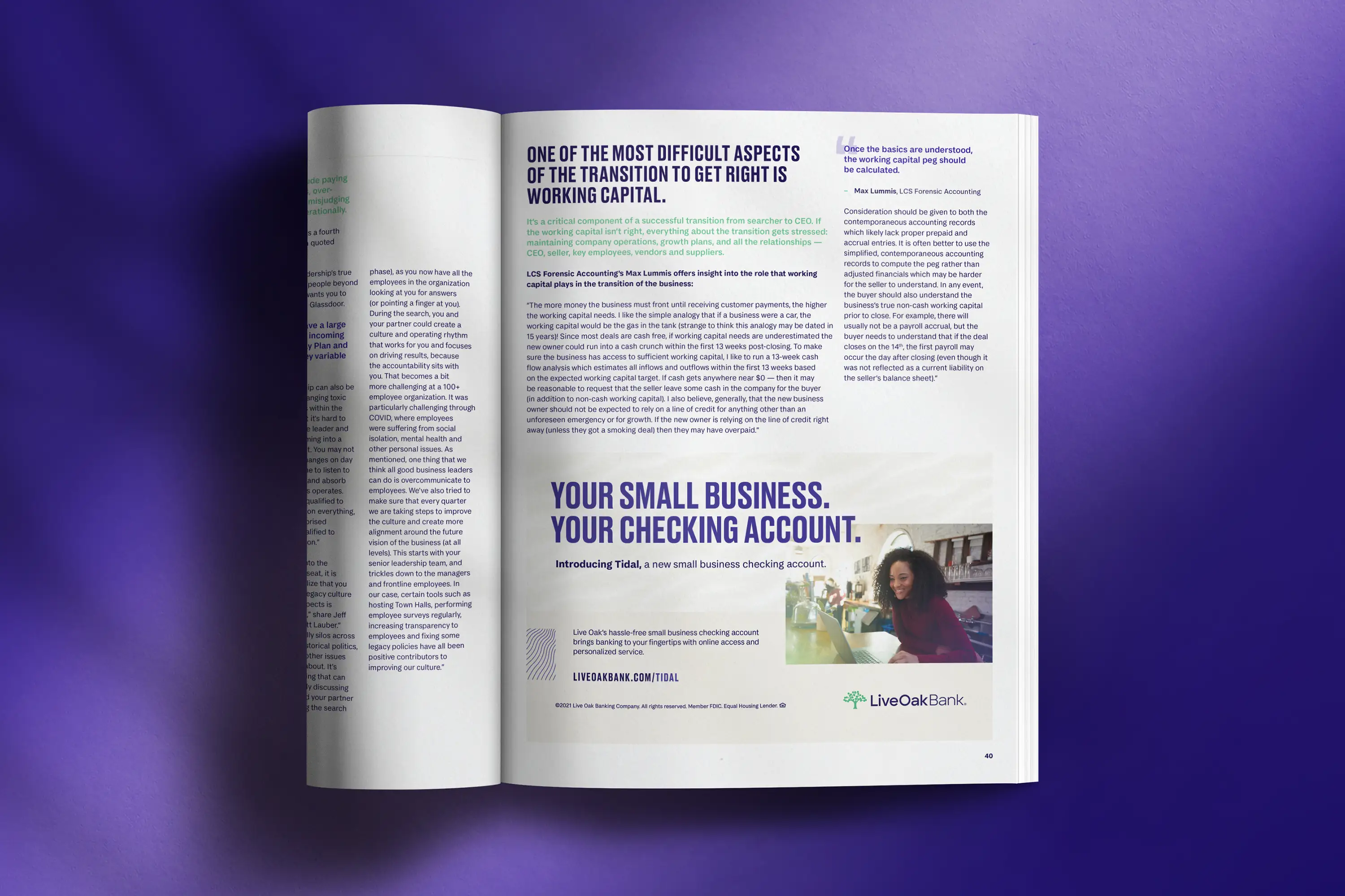
That local presence extended into regional business media, industry publications, and business organizations, allowing the campaign to reach small-business owners in environments where they were already seeking information, resources, and community connections.
Additionally, we developed print and digital executions across Business North Carolina Magazine, Greater Wilmington Business Journal, South Carolina Business Journal, GSA Business Report, Hello Alice, and the Wilmington Chamber of Commerce, with placements ranging from full- and half-page print ads to eNewsletter and digital banner advertising.
Each channel required a tailored approach to hierarchy, messaging, and information density while maintaining consistency with the broader campaign system. Together, OOH and business media helped position Tidal not simply as a new banking product, but as a relevant, credible solution emerging from and built around the needs of small businesses.
Integrated Marketing Campaign
Building the Campaign System
One Idea. Many Currents.
Tidal initially served as a local proving ground before moving into broader commercialization.
The product launched in Q1 2022 and quickly moved beyond its pilot phase, reaching more than 500 accounts in Q2 2022 and 775 customers by the end of Q3, with acquisition accelerating toward 1,300+ customers around the Q3 earnings period.
That progression gave the creative system a second job. It had to scale.
What began as a Wilmington-focused product launch needed to work across local markets, national digital placements, business publications, social platforms, airport environments, direct mail, and sales conversations.
The campaign became an integrated system rather than a collection of individual deliverables.

Digital Advertising
Designing for the Scroll and the Click
The digital campaign expanded the Tidal system into multiple paid acquisition environments.
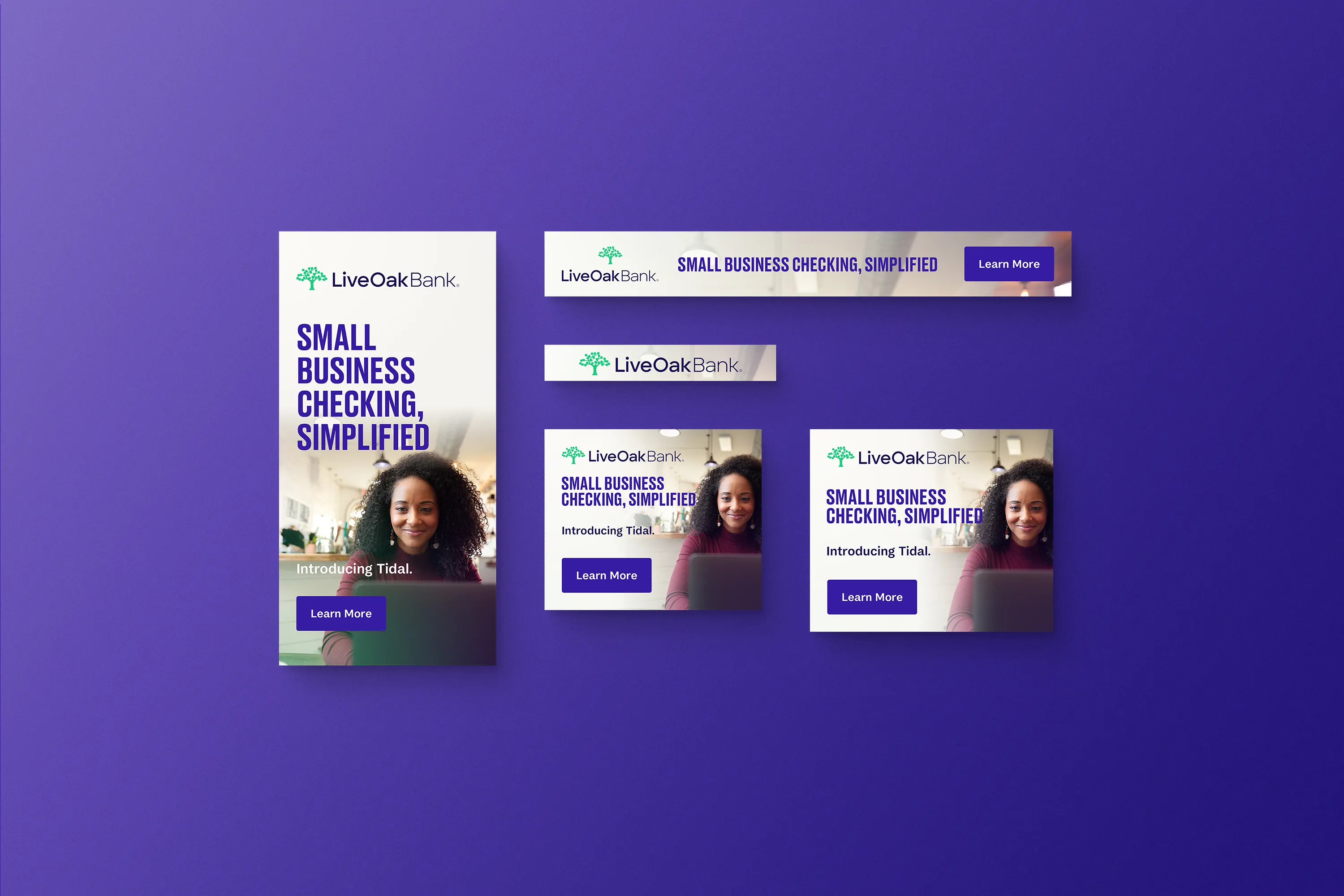
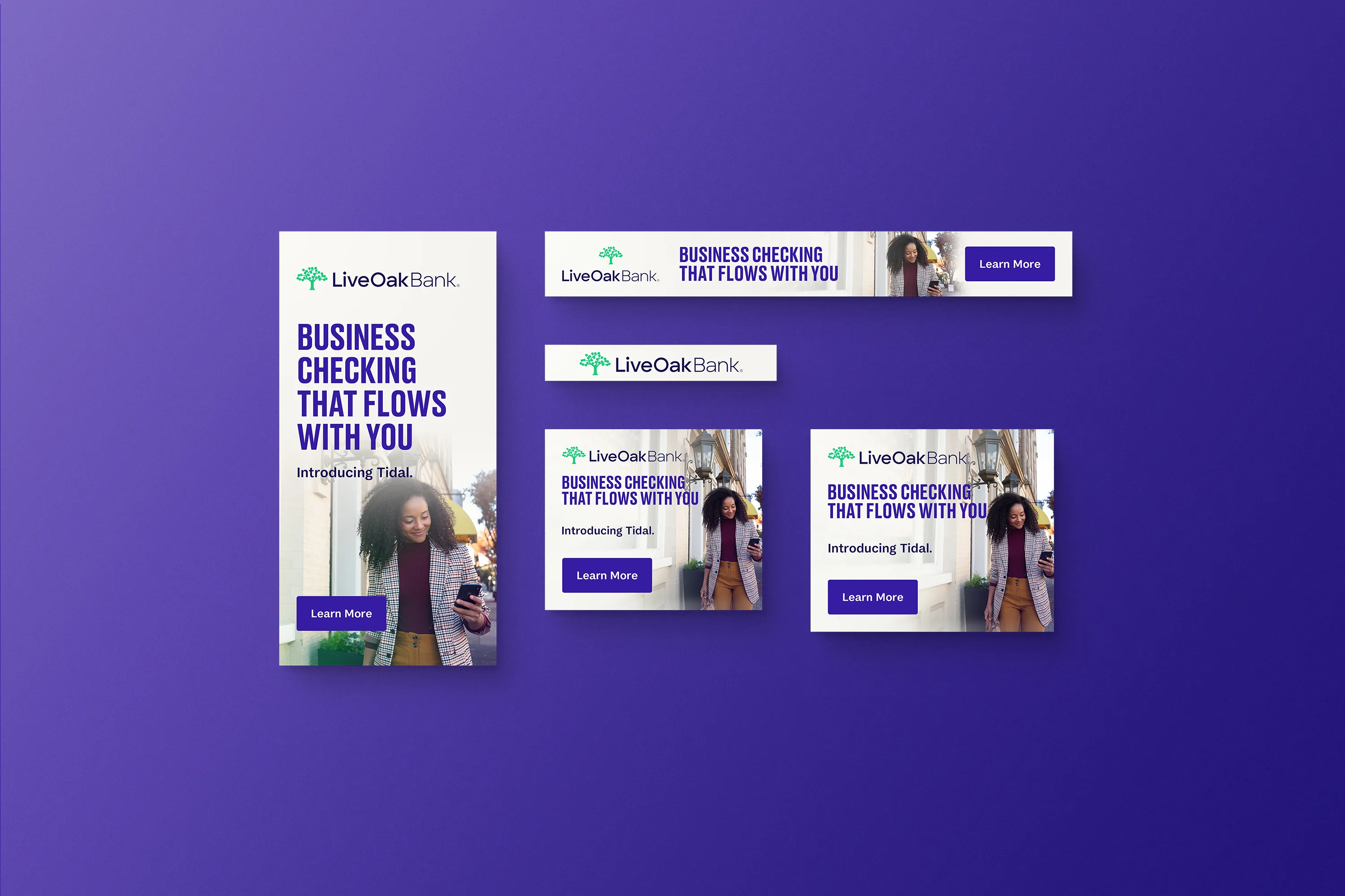
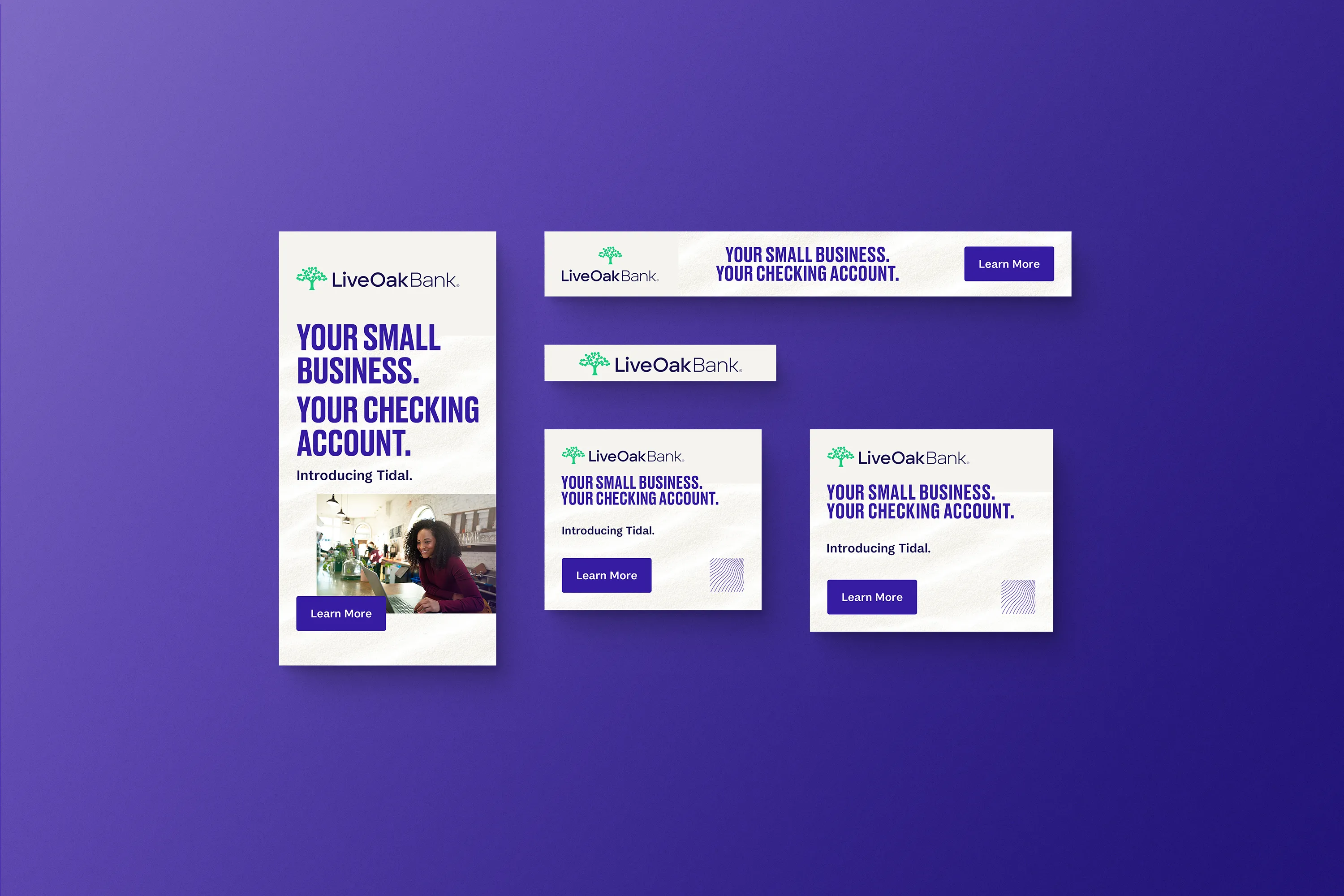
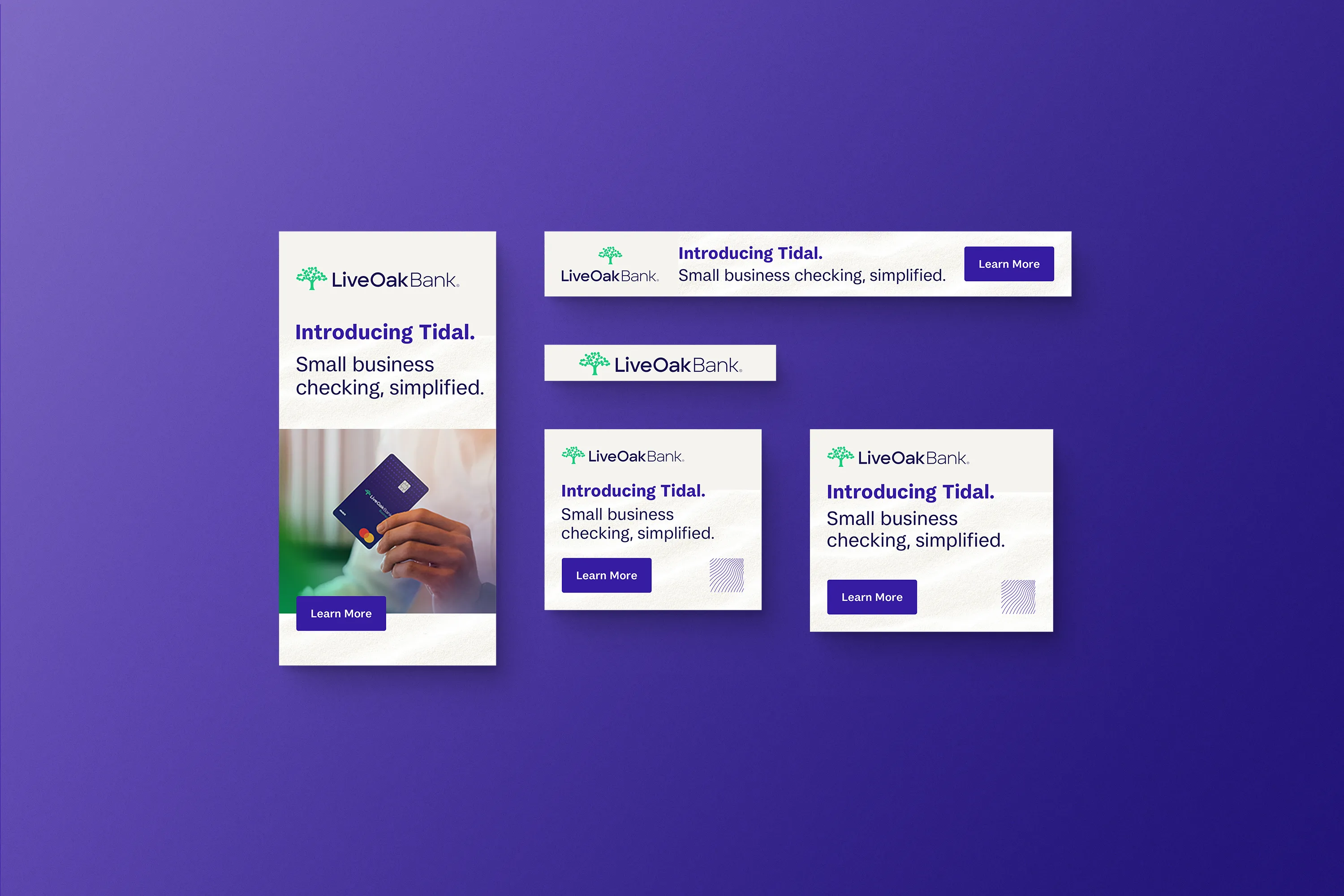
We developed a series of four alternative A/B-tested Google Display concepts, adapting each creative direction across leaderboards, inline rectangles, large rectangles, half-page skyscrapers, and mobile banners.
The challenge was maintaining the campaign's personality while reducing the idea to extremely limited digital real estate.
Our solution was a modular hierarchy built around a few essential elements: product, value proposition, proof, and CTA, which allowed the campaign to remain recognizable at scale while providing enough variation to test different messages and creative approaches.
Digital Advertising—Pinterest
Putting Tidal Into Discovery Mode
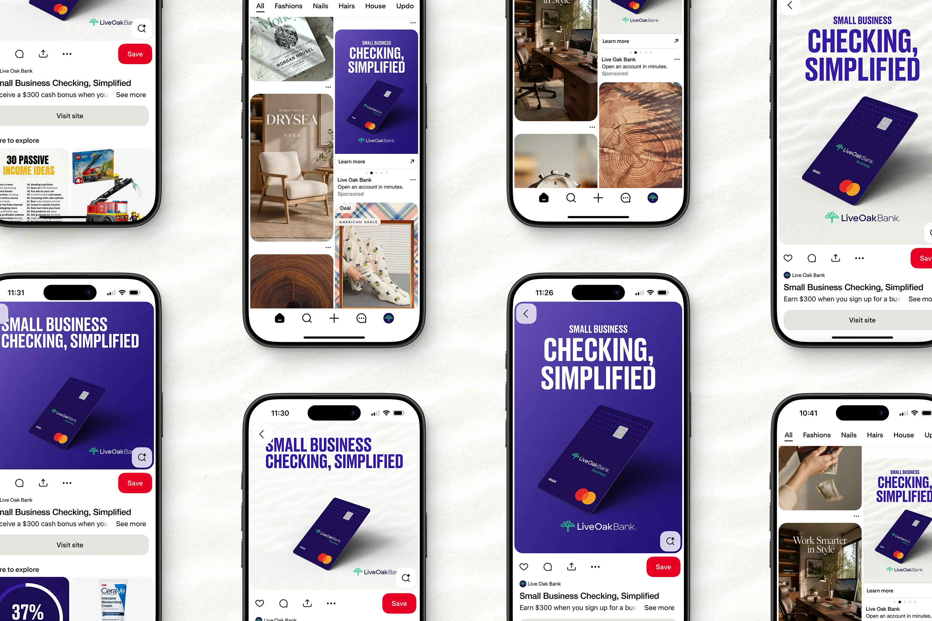
Pinterest required a different approach. Rather than treating the platform like another display network, we adapted the campaign for a more visual, discovery-driven environment.
Creative was developed for both paid and organic home-feed placements, including standard and vertical pins. The campaign maintained the same Tidal messaging framework while allowing photography, composition, and headline treatments to do more of the work.
The result was a more editorial expression of the product that still connected directly back to the broader campaign.
Social Media Marketing
Making the Product Personal
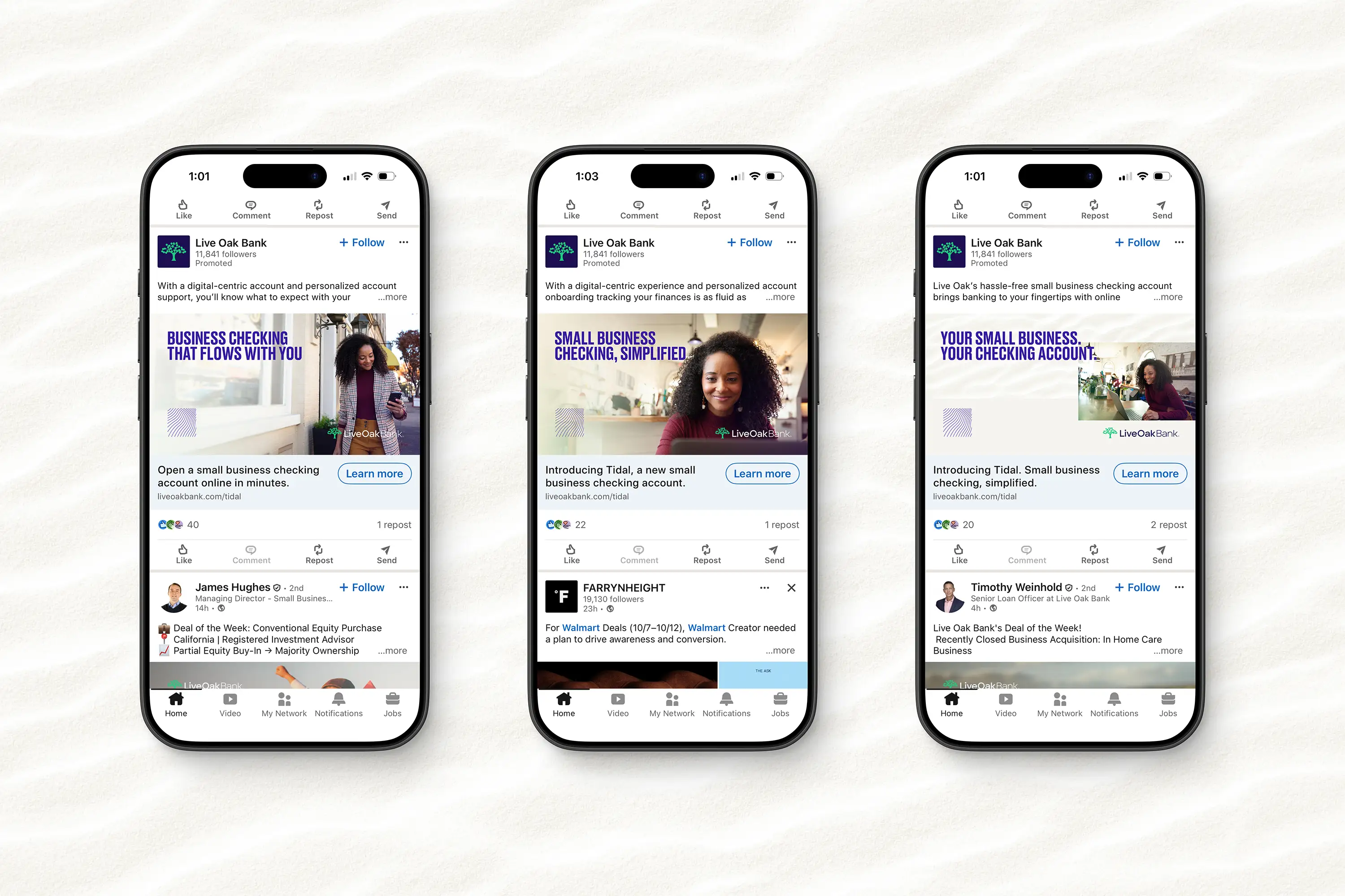
LinkedIn became another important extension of the launch, allowing Tidal to communicate directly with business owners and the broader small-business community.
Paid and organic social executions used the campaign's strongest messaging to create a more conversational entry point into the product.
Rather than simply listing features, the creative positioned Tidal around the realities of running a business—reinforcing the idea that banking should adapt to the customer rather than requiring the customer to adapt to the bank.
Sales and Direct Mail
Turning Awareness into Action
The campaign couldn’t stop at awareness. Once a prospect showed interest, sales and marketing needed tangible tools to explain the product, reinforce its value, and move the relationship forward.
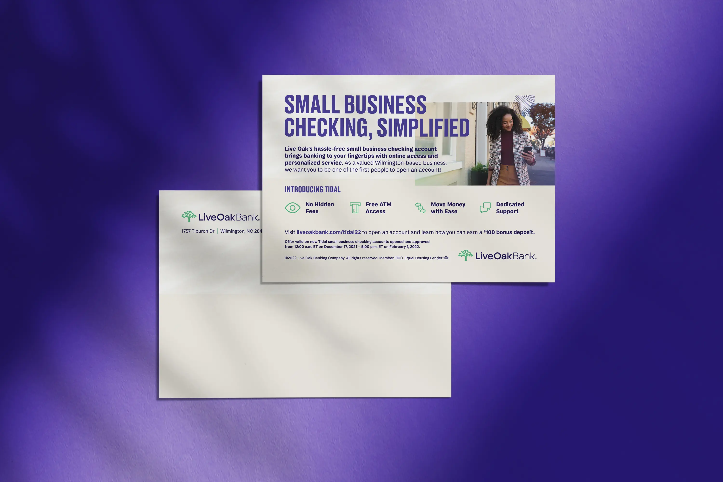
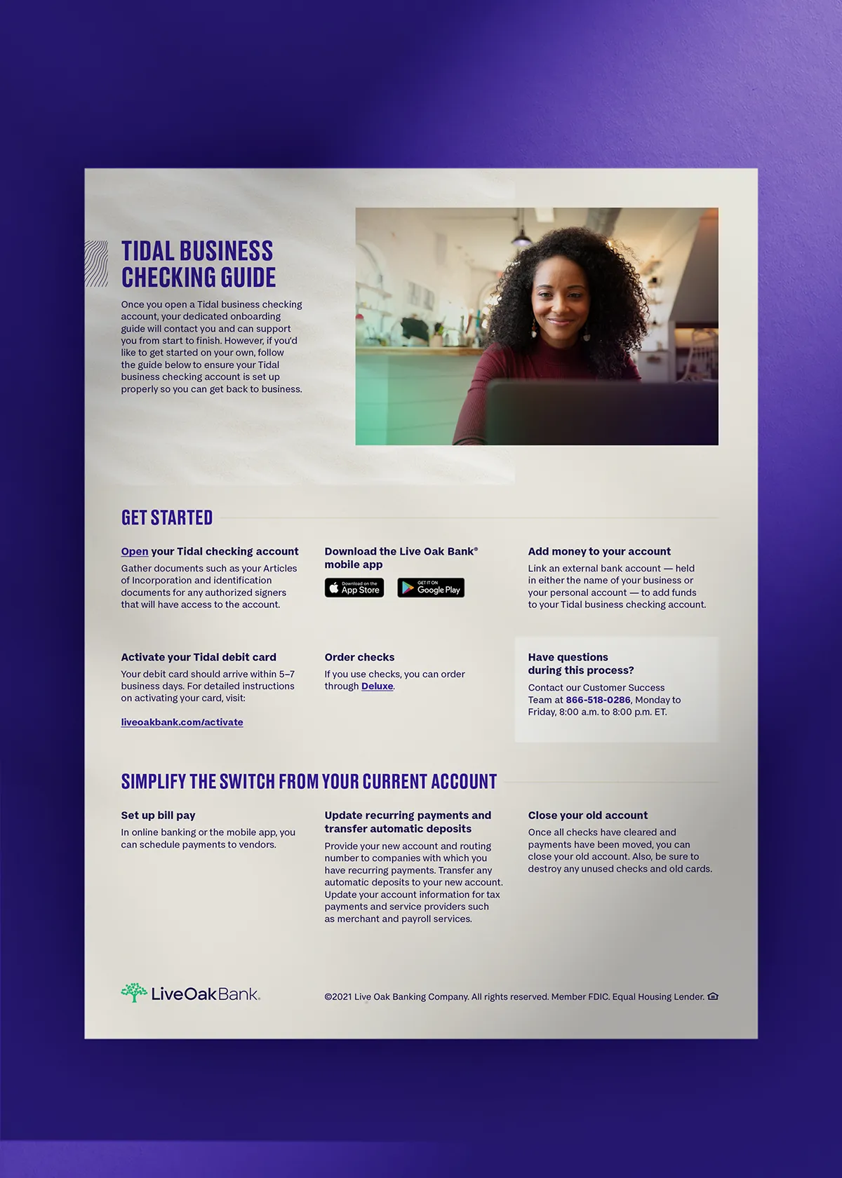
We extended the Tidal visual and messaging system into a range of sales and direct-mail materials, including digital checking guide sales sheets, small business checking handouts, incentive postcards, and pilot-program postcards.
These pieces translated the broader campaign into more informative and conversion-oriented customer touchpoints—giving sales teams practical tools to support conversations while providing prospects a clear path from initial awareness to product consideration.
The postcards, in particular, brought the Tidal message into a more direct product invitation, while the sales collateral provided the additional context needed to explain the offering. Across each format, the same visual language and messaging framework created continuity between advertising, sales conversations, and direct customer communications.

Out-of-Home Advertising
Taking Tidal to the Real World
Tampa International Airport OOH Takeover
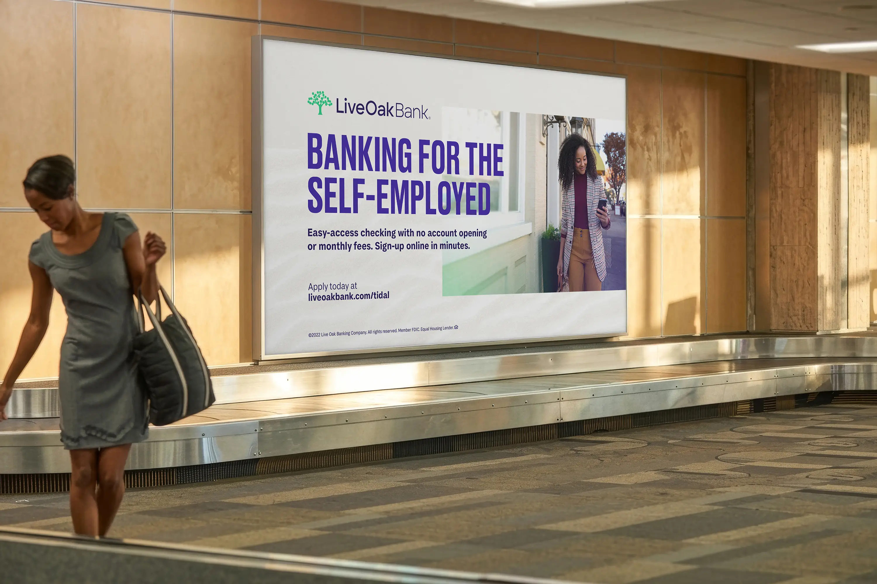
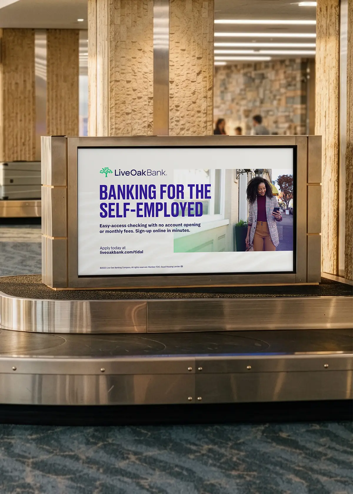
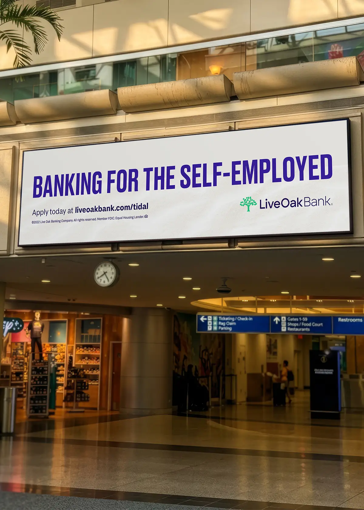
The campaign expanded beyond the Wilmington market with a large-scale OOH takeover at Tampa International Airport, bringing Tidal into a high-traffic environment where audiences encountered the brand in motion.
The challenge was maintaining a cohesive campaign experience whether the message was seen in passing from an escalator or experienced across a large digital display. The campaign didn’t need to explain everything. It needed to communicate the offering quickly, establish immediate brand recognition, and leave a memorable impression.
The solution was disciplined simplicity: short headlines, strong hierarchy, and a consistent visual system that could scale across the environment without losing impact. We developed creative across the rental car center, escalators, baggage claim signage, and digital video walls, each presenting different viewing distances, formats, and dwell times.
Campaign Results
A Flexible Brand for a Fluid Product
The success of the Tidal campaign wasn’t dependent on a single execution. It came from building a flexible visual system capable of carrying the same idea across vastly different customer experiences.
A billboard needed to communicate in seconds. A sales sheet needed to explain. A Pinterest pin needed to stop the scroll; a postcard needed to give people a reason to act. A baggage-claim video wall needed to make an impression at scale.
Despite those differences, each touchpoint felt unmistakably connected because the underlying idea remained consistent: Tidal was about making business checking move with the people using it.
That idea gave Live Oak a product story that was functional enough to communicate a banking proposition, but human enough to make a new financial product feel approachable. And it was rooted in something authentically Live Oak—a digital bank headquartered beside the coastal waters of Wilmington, North Carolina.
The tide became more than a visual metaphor. It became a way to explain the product.
But Tidal was ultimately about more than launching a checking account. It represented the beginning of a broader business strategy: establishing a small-business operating relationship around Live Oak’s existing lending expertise.
Tidal was designed as the foundation for a broader banking ecosystem, creating an opportunity to layer services such as treasury management, payments, working capital, and liquidity solutions into the operating account relationship. As that strategy evolved from a standalone Working Capital Loan launch toward a more integrated operating-account experience, the original creative idea became even more relevant.
Make banking simpler. Make it more connected. Make it flow with the business.
The creative challenge was never simply to sell another checking account. It was to help communicate a fundamental shift in how Live Oak could serve small businesses.
Credits
Team: Live Oak Bank Creative
Creative Direction: Mark Forest
Photography: Adam Alphin
Matt Miller
Art Direction · Design